
Color families


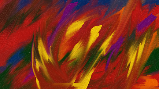
Color Families. Digital art created on canvas. 2022. Afrika Abney


This abstract painting features a captivating blend of red, yellow, and green colors, creating a visually striking piece that is sure to capture the attention of any observer. The artist skillfully utilizes these colors to demonstrate the concept of color families, showcasing how different hues can work together to create a harmonious and dynamic composition. The bold strokes and intricate details in the artwork invite viewers to explore the nuances of each color, from the passionate intensity of red to the vibrant cheerfulness of yellow, and the calming depth of green.


By incorporating primary and secondary colors into the painting, I highlighted the interconnectedness of color families and the ways in which different hues can interact to create new shades and tones. The combination of red and yellow to produce the rich green color serves as a powerful example of how colors can blend and complement each other to evoke emotion and intrigue in the viewer. The meticulous application of each hue in the artwork creates a visual symphony that resonates with the principles of color theory, making it a truly captivating piece of art.


Overall, this abstract painting of red, yellow, and green colors is a stunning representation of the beauty and complexity of color families. The artwork not only showcases the vibrant and dynamic nature of these hues but also invites viewers to appreciate the ways in which colors can harmonize and contrast to create a visually engaging composition.


“A color family is a group of colors that share the same hue on a color wheel. Colors within a family can differ in brightness or saturation. Hue is often referred to as the color family name, such as red, green, or purple.

Some other color terms include:

Tint: A hue with white added to it


Tone: A hue mixed with gray


Shade: A hue that has had black added to it, making it darker


Saturation: How vivid a color appears


Grade: How light or dark a color is


Color theory also includes color groups, such as primary, secondary, and tertiary colors:

Primary colors: Red, yellow, and blue


Secondary colors: Green, orange, and purple, which are mixes of primary colors


Tertiary colors: Yellow-orange, red-orange, red-purple, blue-purple, blue-green, and yellow-green, which are mixes of primary and secondary colors.”

Popular posts from this blog

Nature's Prelude

    Nature's Prelude. Digital art created on canvas. September 23, 2024. Afrika Abney  “Nature's Prelude embodies the serene condition of the sky that heralds the arrival of rain, symbolizing a product that honors the exquisite rhythms of the natural world. This tranquil moment in the atmosphere serves as a precursor to the impending rainfall, which is poised to rejuvenate the landscape. The calmness that envelops the sky acts as a gentle reminder of the continuous cycles inherent in weather patterns.”

Intention of emphasizing my comprehensive background

Numerous individuals had the chance to engage with me, yet you chose to dismiss me and cast me aside as if I were insignificant. You now seem to believe that I am aware of the context of your remarks, but that assumption is incorrect. In 2021, I established this branding blog to showcase different facets of my experiences, services, and professional endeavors, with the intention of emphasizing my comprehensive background. ​PAST SELECTED ART EXHIBITIONS ​• Virtual Art Exhibition and Poetry Reading. February 19, 2023 ​• The National Daughter Daddy Tour. National City Christian Church, Washington, D.C. 2004 - 2006 • Every Picture Tells A Story. Moca DC, Washington, D.C. January 6, 2006 – January 27, 2006 • "Visions." Ellingtons on 8th, Washington, D.C. May 31 - June 28, 2006.Curated by Prelli Anthony Williams. Reception, May 31, 2006 from 6-8pm and Closing Reception, June 28, 2006 • "The Power Within." El Tamarindo, Washington, D.C. July 1 - 31, 2006. Curated by D.Edwa...

Whispers of Color

    I enjoy creating my art using vibrant hues of yellow-orange, purple, and magenta coupled with black and navy blue. “The hue of yellow-orange is frequently associated with qualities such as creativity, enthusiasm, and an overarching sense of optimism. This lively color radiates a spirited energy that can stimulate innovative thought and foster a positive perspective on life. The warm undertones of this vibrant shade evoke sensations of joy and vitality, creating a distinctive fusion that promotes both artistic expression and an uplifting attitude. The interplay of yellow's brightness with the warmth of orange results in a unique palette that encourages individuals to embrace their creative instincts. Purple is a color that embodies creativity, merging the serene stability of blue with the dynamic energy of red. This intriguing combination fosters a sense of imagination and originality, encouraging individuals to venture into uncharted territories of thought. The rich and vi...

Perceptual Harmony

  Perceptual Harmony. Digital art created on canvas. September 14, 2024. Afrika Abney 

Profound Azure

    Profound Azure. Digital art created on canvas. September 18, 2024. Afrika Abney  “Profound Azure embodies a deep and vibrant blue hue that conjures feelings of depth and creativity. This particular shade is not merely a color; it represents a vast expanse that invites contemplation and sparks inspiration. The richness of this blue can evoke a sense of tranquility.” Profound Azure is inspired by Profound Blue Inspiration.

Insightful Discussions

  Quote found on the Internet  “Eleanor Roosevelt once articulated a profound observation regarding the nature of intellectual discourse. She suggested that the most insightful individuals engage in conversations centered around ideas, exploring concepts that can inspire change and innovation. This perspective emphasizes the importance of critical thinking and the pursuit of knowledge, encouraging individuals to elevate their discussions beyond the mundane and to focus on the transformative power of ideas. In contrast, Roosevelt pointed out that those with a more conventional mindset tend to focus their discussions on events. This approach, while still valuable, often limits the scope of conversation to what is happening in the world around us, rather than delving into the underlying principles or philosophies that drive those events. By concentrating on occurrences, average minds may miss the opportunity to analyze the implications and lessons that can be drawn from them, the...

Respect Spectrum

  Respect Spectrum. Digital art created on canvas. September 18, 2024. Afrika Abney “The concept of Respect Spectrum encompasses a diverse array of colors, specifically shades of pink, purple, and blue. The Respect Spectrum is a multifaceted concept that incorporates a variety of colors, particularly emphasizing shades of pink, purple, and blue. Each of these colors is imbued with distinct meanings and cultural associations that contribute to the overarching theme of respect. Pink is often seen as a gentle and nurturing color, evoking feelings of compassion and understanding, which can foster an atmosphere of respect in interpersonal relationships. Purple, historically associated with royalty and nobility, conveys a sense of dignity and honor, making it a powerful color in contexts where respect is paramount. Blue, on the other hand, is commonly associated with trust and reliability, qualities that are essential in establishing and maintaining respectful interactions.”

Dark chocolate

  “The color is a deep, rich shade of brown that resembles the hue of dark chocolate or freshly brewed coffee, evoking a sense of warmth and earthiness. The representation of dark chocolate within the realm of abstract painting serves as a fascinating exploration of color, texture, and form. Artists often utilize the rich, deep hues associated with dark chocolate to evoke a sense of indulgence and sophistication, while the fluidity of abstract techniques allows for a dynamic interpretation of its essence. Through the interplay of bold brushstrokes and layered compositions, the visual experience can mimic the complexity of dark chocolate's flavor profile, inviting viewers to engage with the artwork on both an emotional and sensory level. This artistic approach not only highlights the aesthetic qualities of dark chocolate but also encourages a deeper contemplation of its cultural significance and the sensory pleasures it embodies.”

Restful Blue

  I woke from my restful sleep several hours ago. I chose various shades of blue using paintapp.  This choice was not arbitrary; I aimed to explore the calming and inspiring qualities that different shades of blue can evoke. Restful Blue is a solid blue background designed for creativity.  When examining Restful Blue, one can see hints of purple within this shade of blue. 

Awareness Revolution

Awareness Revolution. Digital art created on canvas. September 25, 2024. Afrika Abney “The significant societal transformations that have emerged in response to issues of racism and discrimination, particularly concerning the Black community. This awareness serves as a catalyst for discussions surrounding systemic inequalities and the historical context that has shaped the experiences of Black individuals in the nation’s capital. By fostering a deeper understanding of these societal changes, the movement aims to address the persistent challenges faced by marginalized groups and promote a more equitable society. In recent years, Washington, D.C., has witnessed a growing consciousness regarding the impact of racism and discrimination on the Black population. This heightened awareness has prompted various initiatives and movements aimed at dismantling systemic barriers and advocating for social justice. As communities come together to confront these issues, there is a collective effort to...