
Natural Harmony, digital art created on canvas


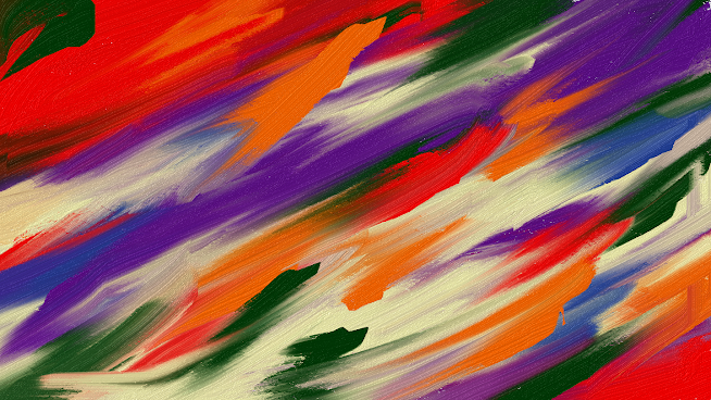
Natural Harmony. Digital art created on canvas. August 10, 2024. Afrika Abney


The title "Natural Harmony" evokes a sense of equilibrium and cohesion among the colors employed, emphasizing the inherent and organic nature of the creative process. It reflects a thoughtful interplay of hues that work together seamlessly, suggesting a deeper connection to the natural world and the artistic journey.


My artistic practice revolves around the instinctive expression of my thoughts and feelings, which I translate into abstract compositions on canvas. This approach allows me to explore the fluidity of color and form, resulting in pieces that are both spontaneous and deeply personal. Each stroke and hue emerges from an intuitive place, reflecting my inner landscape and the world around me.


Through the medium of abstract painting, I aim to capture the essence of what feels natural to me, allowing the canvas to become a space where my emotions and ideas can freely manifest. This process is not merely about the application of paint; it is an exploration of the relationship between color, texture, and form

Popular posts from this blog

Whispers of Color

    I enjoy creating my art using vibrant hues of yellow-orange, purple, and magenta coupled with black and navy blue. “The hue of yellow-orange is frequently associated with qualities such as creativity, enthusiasm, and an overarching sense of optimism. This lively color radiates a spirited energy that can stimulate innovative thought and foster a positive perspective on life. The warm undertones of this vibrant shade evoke sensations of joy and vitality, creating a distinctive fusion that promotes both artistic expression and an uplifting attitude. The interplay of yellow's brightness with the warmth of orange results in a unique palette that encourages individuals to embrace their creative instincts. Purple is a color that embodies creativity, merging the serene stability of blue with the dynamic energy of red. This intriguing combination fosters a sense of imagination and originality, encouraging individuals to venture into uncharted territories of thought. The rich and vi...

Green Essence

  “Green is a color that resonates deeply with themes of prosperity and accomplishment. It represents not only the physical aspects of growth and renewal but also the emotional and spiritual vitality that comes from achieving goals. The presence of this color can serve as an inspiring reminder of the fruitful results that often follow diligent work and unwavering dedication.” I have successfully cultivated a portfolio of artwork sales to prestigious clients, including Esther Productions, Inc., which has allowed me to forge robust relationships grounded in trust and the delivery of high-quality work. My overarching goal is to produce artwork that captivates and engages diverse audiences, while simultaneously fostering enduring connections within the art community. This commitment to excellence not only enhances my reputation but also contributes to a vibrant artistic dialogue. With a solid history of building a dedicated client base, I have consistently generated repeat business and...

Branding Initiative

“The initiative focuses on a comprehensive branding strategy that encompasses various artistic disciplines, including visual arts, literature, dance, and consulting services. This multifaceted approach aims to create a cohesive identity that resonates across different creative fields, allowing for a richer engagement with diverse audiences. By integrating these elements, the initiative seeks to elevate the perception of each discipline while fostering collaboration and innovation among artists and consultants.” Why branding is important? https://msafrikaabney.blogspot.com/2024/07/why-branding-is-important.html Branding Blog https://msafrikaabney.blogspot.com/2024/07/branding-blog.html

Restful Blue

  I woke from my restful sleep several hours ago. I chose various shades of blue using paintapp.  This choice was not arbitrary; I aimed to explore the calming and inspiring qualities that different shades of blue can evoke. Restful Blue is a solid blue background designed for creativity.  When examining Restful Blue, one can see hints of purple within this shade of blue. 

Intensity through purpose

  On this day, September 24, 2024, which falls on a Tuesday, “the color dark red encapsulates the themes of intensity, passion, and determination. This rich shade resonates with the drive and enthusiasm that characterize individuals who are committed to their objectives. It serves as an emblem of strength and resilience, inspiring a sense of urgency and purpose in the journey toward achieving one's goals.” My mission is to empower individuals and organizations to elevate their visibility, engage with their target audience, and ultimately achieve their business goals through strategic consulting services. 

Detailed Oriented and Information

  Quote found on the Internet  I have no clue what is going on because I am busy keeping to myself and working from home.I am working on my branding, digital art and my services. Many of you have inaccurate information. Today is September 11, 2024.  Selected Expertise & Skills: Strong work ethic Detailed oriented  Branding Strategy Digital Art Creation Service Development

Deep Blue Imagination

  “Deep Blue Imagination highlights the significance of color and the concept of creativity, proposing a vibrant atmosphere that fosters artistic pursuits. The use of deep blue not only evokes a sense of tranquility but also stimulates the mind.”

CreativeSpectrum Consulting

  “The realm of consulting is often characterized by a specific palette of colors that convey professionalism, trust, and expertise. These colors play a crucial role in branding and visual identity, as they can significantly influence perceptions and emotions. For instance, blue is frequently utilized in consulting.Similarly, green is employed to symbolize growth and innovation, reflecting the forward-thinking nature of consulting services. In addition to blue and green, other colors such as gray and black are commonly integrated into the consulting aesthetic. Gray represents neutrality and balance, making it an ideal choice for firms that aim to project a sense of impartiality and sound judgment. Black, on the other hand, conveys sophistication. Furthermore, the choice of colors in consulting extends beyond mere aesthetics; it also plays a vital role in communication and client engagement.Colors can evoke specific emotions and reactions, which can be leveraged to create a more imp...

Artistry Brush Essence

  Artistry Brush Essence. Digital art created on canvas. September 29, 2024. Afrika Abney 

Respect Spectrum

  Respect Spectrum. Digital art created on canvas. September 18, 2024. Afrika Abney “The concept of Respect Spectrum encompasses a diverse array of colors, specifically shades of pink, purple, and blue. The Respect Spectrum is a multifaceted concept that incorporates a variety of colors, particularly emphasizing shades of pink, purple, and blue. Each of these colors is imbued with distinct meanings and cultural associations that contribute to the overarching theme of respect. Pink is often seen as a gentle and nurturing color, evoking feelings of compassion and understanding, which can foster an atmosphere of respect in interpersonal relationships. Purple, historically associated with royalty and nobility, conveys a sense of dignity and honor, making it a powerful color in contexts where respect is paramount. Blue, on the other hand, is commonly associated with trust and reliability, qualities that are essential in establishing and maintaining respectful interactions.”