
Sleepy Child, Values and African Heritage 1992


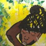
Sleepy Child. Painting on canvas board.1992. Afrika Abney


“The artwork titled "Sleepy Child" was generously contributed by me several years back. I crafted this piece during my time as a student at Bell, specifically between 1991 and 1993. This period of my life was instrumental in shaping my artistic vision and personal expression, allowing me to explore various themes and techniques that would later define my work.


In "Sleepy Child," the color palette serves as a profound reflection of my identity and core beliefs, intricately weaving together elements that resonate with my experiences as an African-American. Each hue and shade was deliberately chosen to convey emotions and narratives that are deeply rooted in my cultural background. This painting is not merely an artistic endeavor; it encapsulates the essence of who I am and the values I hold dear.


The decision to donate this painting was motivated by a desire to share my story and connect with a broader audience. By placing "Sleepy Child" in a public space, I hoped to foster dialogue and understanding around the themes of identity and representation. This artwork stands as a testament to my journey and the rich tapestry of experiences that inform my perspective.”


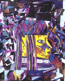
This is a collage that I created many years ago and gave away. It was one of the pieces that I featured on my old greeting cards. I created this piece while I was a student at Bell from 1991 - 1993.


Values. Greeting card created and designed by Afrika Abney


“The selection of colors for the collage—blue, pink, yellow, black, and purple—carries profound significance for me, each hue reflecting a facet of my identity and cultural heritage. Black, for instance, is emblematic of my roots, serving as a reminder of my ancestry and the strength derived from it. Blue conveys a sense of trust and wisdom, evoking feelings of serenity and reliability. Pink, on the other hand, symbolizes compassion and love, representing my empathetic nature. Yellow is associated with intellect and joy, embodying a sense of optimism and clarity of thought, while purple, a color that is seldom found in the natural world, resonates with themes of spirituality and creativity.


Delving deeper into the symbolism of these colors reveals a rich tapestry of meanings. Blue not only signifies trust but also evokes a connection to the heavens, suggesting a higher purpose or aspiration. Pink's representation of compassion highlights my artist's nurturing spirit. Yellow's association with cheerfulness and logic underscores the importance of a balanced mind, where joy and reason coexist harmoniously. Black, often linked to power and spirituality, reflects a duality that encompasses both strength and introspection. Meanwhile, purple's rarity in nature enhances its sacred connotations, linking it to the divine and the imaginative realms.


Ultimately, my collage is a vivid expression of my personal and professional values and beliefs, with each color meticulously chosen to resonate with my identity and cultural narrative. The interplay of these colors not only creates a visually striking composition but also invites viewers to engage with the deeper meanings embedded within. By weaving together these symbolic hues, my narrative speaks to my experiences. This thoughtful arrangement of colors serves as a powerful testament to my journey, reflecting my unique perspective and the significance of my cultural background.”


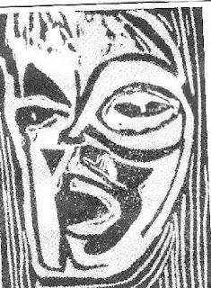
African Heritage. 1992. Afrika Abney


“During my tenure at Bell, African Heritage was prominently showcased in a brochure. This particular piece has a rich history, having been donated several years prior to my involvement, which adds to its significance and cultural value.


I engaged in the art of Linocut, a printmaking method that is often referred to as lino printing or linoleum art. This technique is a derivative of the traditional woodcut process, utilizing a sheet of linoleum—occasionally affixed to a wooden block—as the relief surface for creating intricate designs and images.”

Popular posts from this blog

Nature's Prelude

    Nature's Prelude. Digital art created on canvas. September 23, 2024. Afrika Abney  “Nature's Prelude embodies the serene condition of the sky that heralds the arrival of rain, symbolizing a product that honors the exquisite rhythms of the natural world. This tranquil moment in the atmosphere serves as a precursor to the impending rainfall, which is poised to rejuvenate the landscape. The calmness that envelops the sky acts as a gentle reminder of the continuous cycles inherent in weather patterns.”

Intention of emphasizing my comprehensive background

Numerous individuals had the chance to engage with me, yet you chose to dismiss me and cast me aside as if I were insignificant. You now seem to believe that I am aware of the context of your remarks, but that assumption is incorrect. In 2021, I established this branding blog to showcase different facets of my experiences, services, and professional endeavors, with the intention of emphasizing my comprehensive background. ​PAST SELECTED ART EXHIBITIONS ​• Virtual Art Exhibition and Poetry Reading. February 19, 2023 ​• The National Daughter Daddy Tour. National City Christian Church, Washington, D.C. 2004 - 2006 • Every Picture Tells A Story. Moca DC, Washington, D.C. January 6, 2006 – January 27, 2006 • "Visions." Ellingtons on 8th, Washington, D.C. May 31 - June 28, 2006.Curated by Prelli Anthony Williams. Reception, May 31, 2006 from 6-8pm and Closing Reception, June 28, 2006 • "The Power Within." El Tamarindo, Washington, D.C. July 1 - 31, 2006. Curated by D.Edwa...

Whispers of Color

    I enjoy creating my art using vibrant hues of yellow-orange, purple, and magenta coupled with black and navy blue. “The hue of yellow-orange is frequently associated with qualities such as creativity, enthusiasm, and an overarching sense of optimism. This lively color radiates a spirited energy that can stimulate innovative thought and foster a positive perspective on life. The warm undertones of this vibrant shade evoke sensations of joy and vitality, creating a distinctive fusion that promotes both artistic expression and an uplifting attitude. The interplay of yellow's brightness with the warmth of orange results in a unique palette that encourages individuals to embrace their creative instincts. Purple is a color that embodies creativity, merging the serene stability of blue with the dynamic energy of red. This intriguing combination fosters a sense of imagination and originality, encouraging individuals to venture into uncharted territories of thought. The rich and vi...

Profound Azure

    Profound Azure. Digital art created on canvas. September 18, 2024. Afrika Abney  “Profound Azure embodies a deep and vibrant blue hue that conjures feelings of depth and creativity. This particular shade is not merely a color; it represents a vast expanse that invites contemplation and sparks inspiration. The richness of this blue can evoke a sense of tranquility.” Profound Azure is inspired by Profound Blue Inspiration.

Insightful Discussions

  Quote found on the Internet  “Eleanor Roosevelt once articulated a profound observation regarding the nature of intellectual discourse. She suggested that the most insightful individuals engage in conversations centered around ideas, exploring concepts that can inspire change and innovation. This perspective emphasizes the importance of critical thinking and the pursuit of knowledge, encouraging individuals to elevate their discussions beyond the mundane and to focus on the transformative power of ideas. In contrast, Roosevelt pointed out that those with a more conventional mindset tend to focus their discussions on events. This approach, while still valuable, often limits the scope of conversation to what is happening in the world around us, rather than delving into the underlying principles or philosophies that drive those events. By concentrating on occurrences, average minds may miss the opportunity to analyze the implications and lessons that can be drawn from them, the...

Respect Spectrum

  Respect Spectrum. Digital art created on canvas. September 18, 2024. Afrika Abney “The concept of Respect Spectrum encompasses a diverse array of colors, specifically shades of pink, purple, and blue. The Respect Spectrum is a multifaceted concept that incorporates a variety of colors, particularly emphasizing shades of pink, purple, and blue. Each of these colors is imbued with distinct meanings and cultural associations that contribute to the overarching theme of respect. Pink is often seen as a gentle and nurturing color, evoking feelings of compassion and understanding, which can foster an atmosphere of respect in interpersonal relationships. Purple, historically associated with royalty and nobility, conveys a sense of dignity and honor, making it a powerful color in contexts where respect is paramount. Blue, on the other hand, is commonly associated with trust and reliability, qualities that are essential in establishing and maintaining respectful interactions.”

Restful Blue

  I woke from my restful sleep several hours ago. I chose various shades of blue using paintapp.  This choice was not arbitrary; I aimed to explore the calming and inspiring qualities that different shades of blue can evoke. Restful Blue is a solid blue background designed for creativity.  When examining Restful Blue, one can see hints of purple within this shade of blue. 

Perceptual Harmony

  Perceptual Harmony. Digital art created on canvas. September 14, 2024. Afrika Abney 

Vital knowledge and professional expertise

    My objective is clearly articulated: to share vital knowledge and professional expertise related to the consulting services I have been providing since 1992. I concentrate on developing media campaigns specifically designed for individuals, small businesses, and nonprofit organizations. Throughout my career, I have had the honor of partnering with a diverse range of clients across multiple sectors, including the arts, entertainment, media, and nonprofit domains. This broad spectrum of experience has granted me a profound insight into the distinct challenges and opportunities that each of these industries faces. The branding blog has recently undergone updates by its creator, who has been actively engaged in consulting services since 1992. With a specialization in crafting media campaigns for individuals, small enterprises, and nonprofit organizations, the creator has collaborated with clients spanning various industries. This extensive background not only highlights their ...

Navy Nightfall Canvas

  “The Navy Nightfall Canvas is a striking representation of the deep, rich hues associated with twilight over the ocean. This artwork captures the essence of a serene evening, where the navy blue sky seamlessly blends with the horizon, evoking a sense of calm and tranquility. The canvas serves as a background for creativity.”